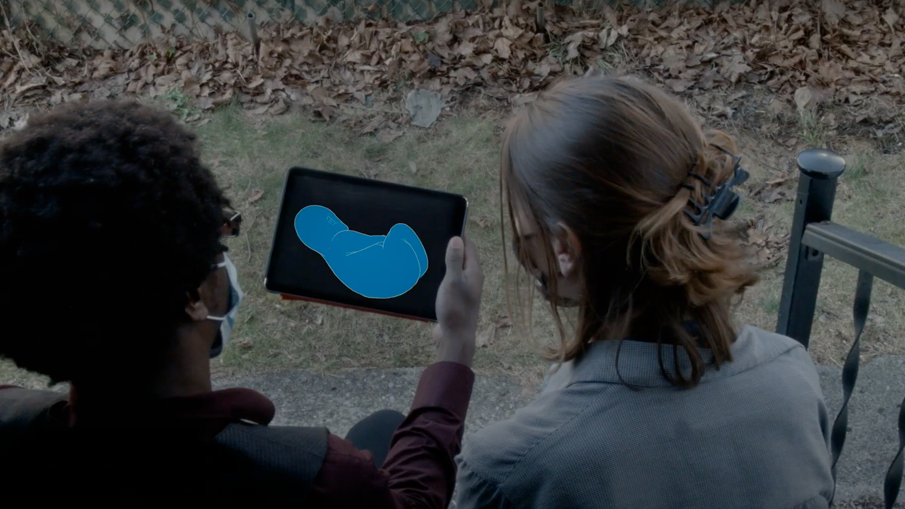
BRIGHTWATER'S 2025 REBRAND
Opportunity: Changing your perspective on Senior Living & reflecting a more authentic brand.
Approach: Focused on storytelling to create an emotional connection with prospects, & company.
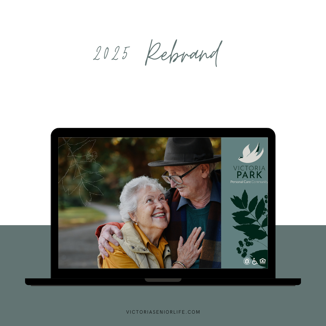
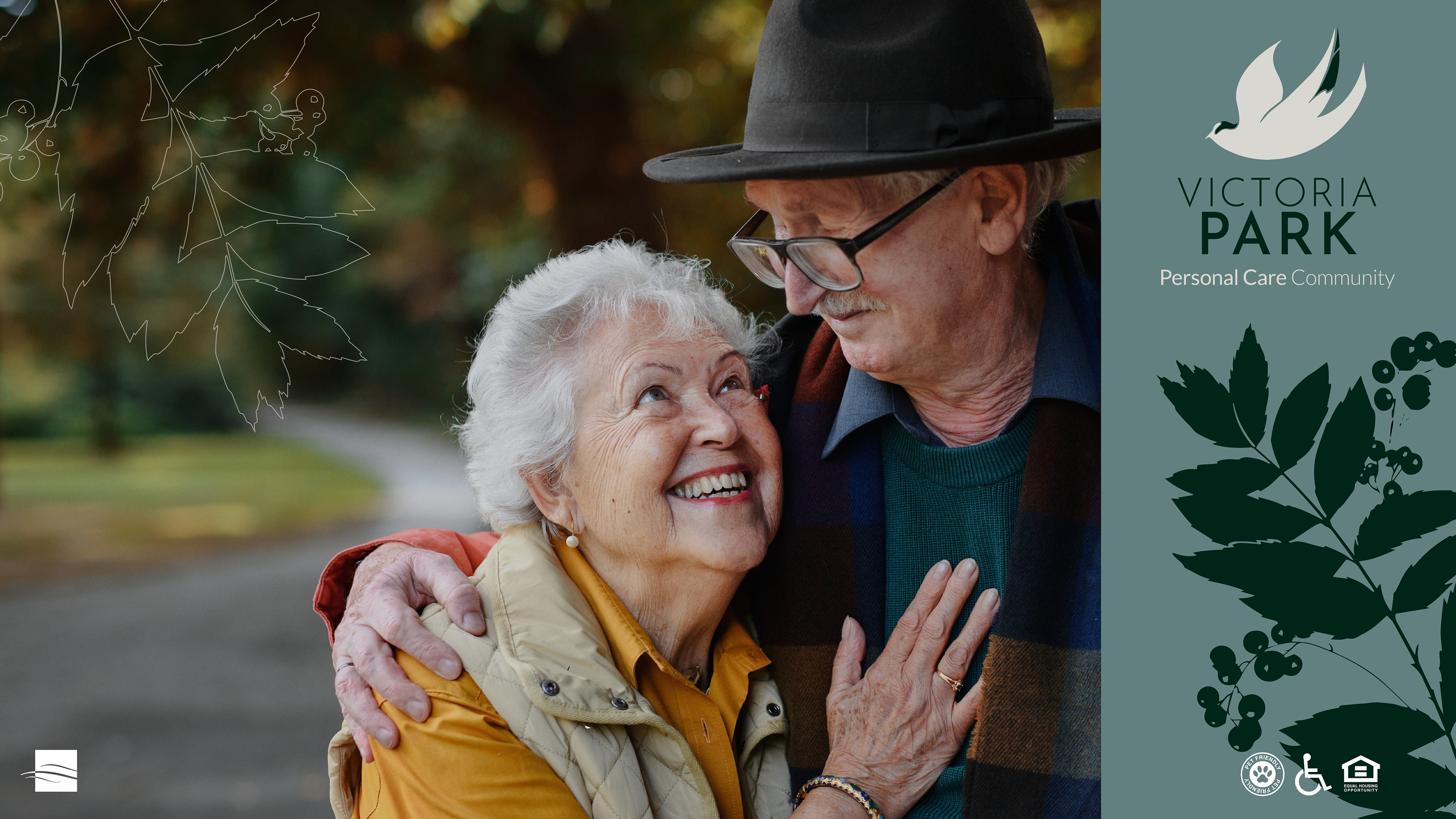
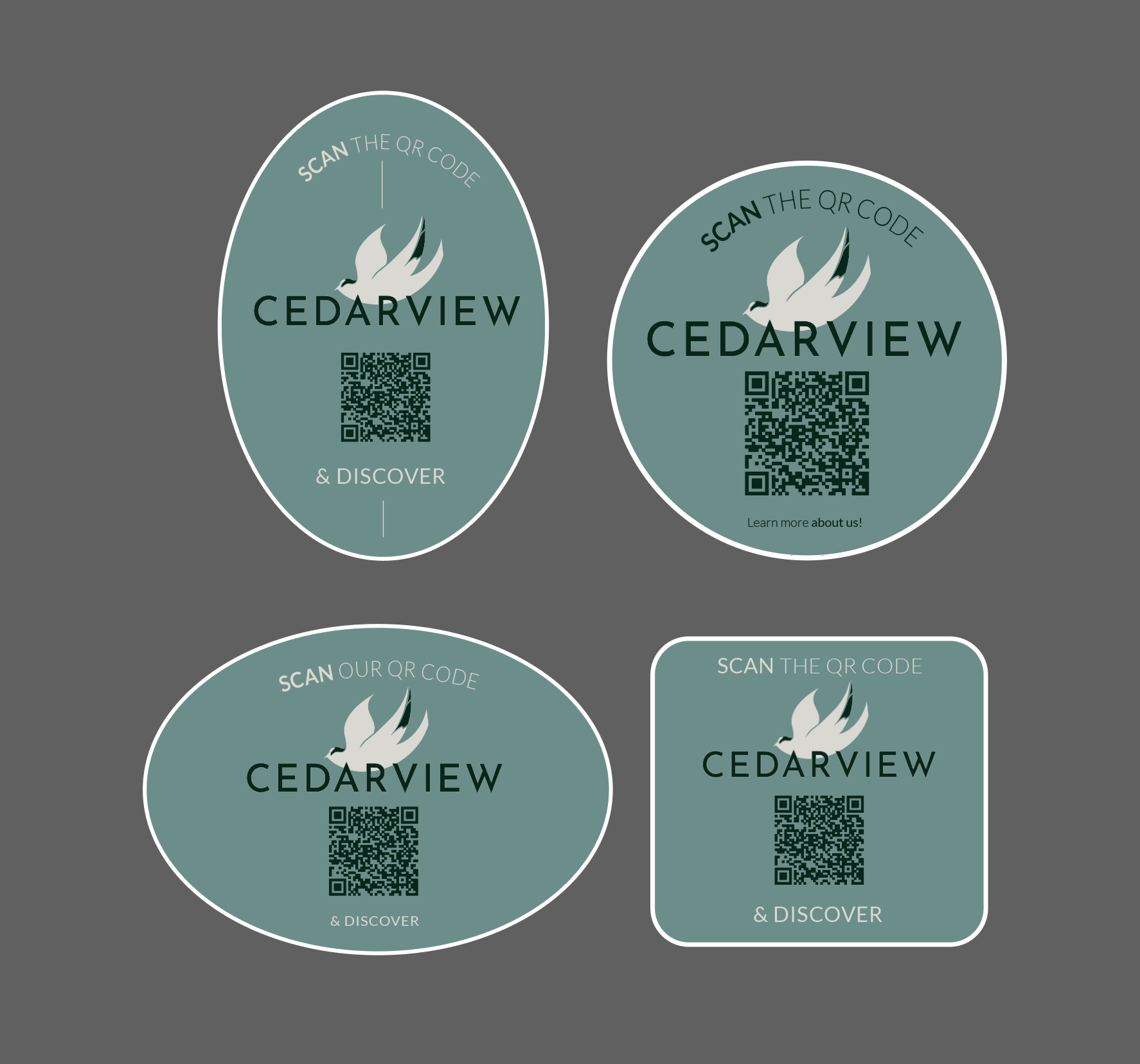
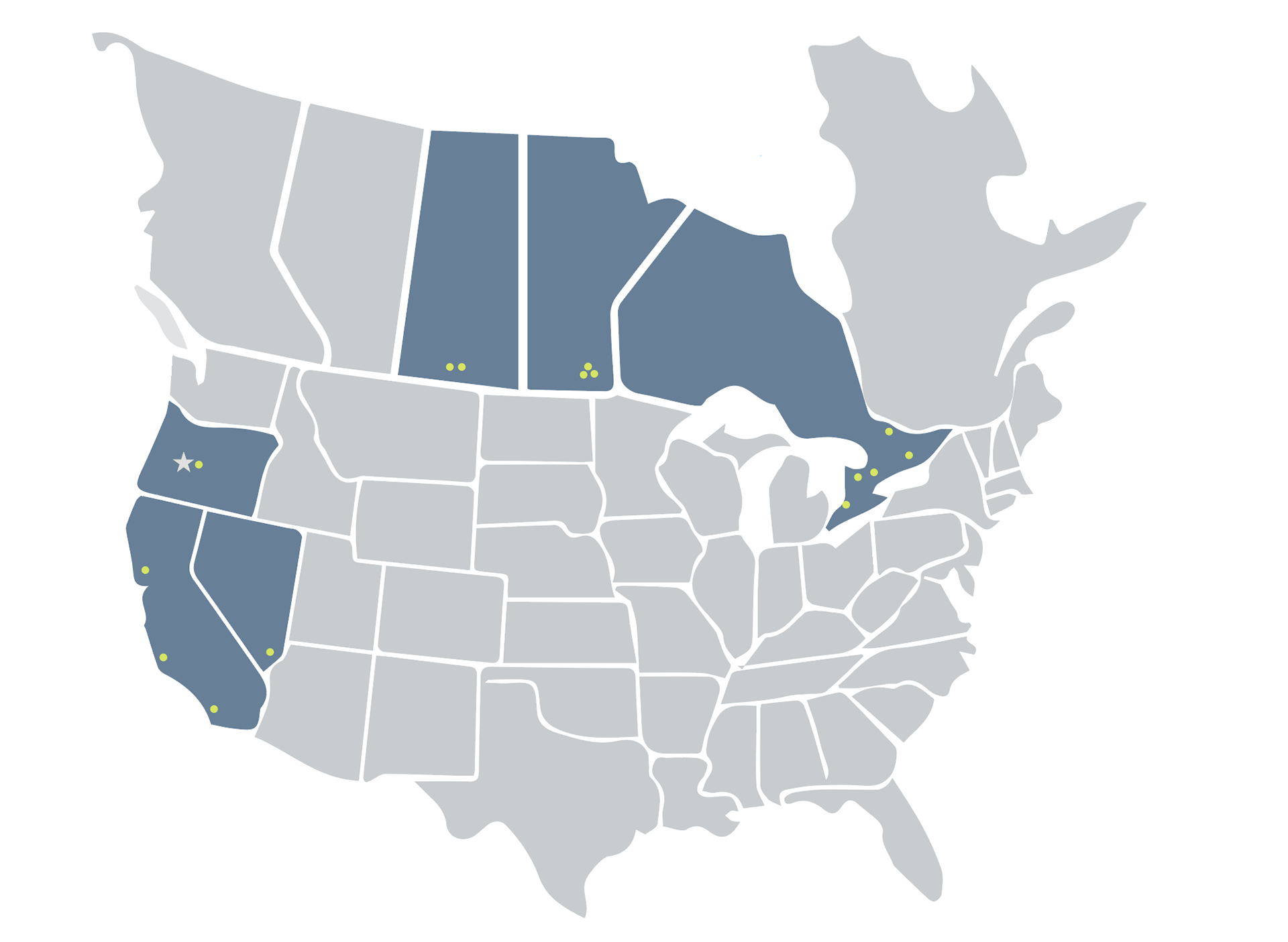
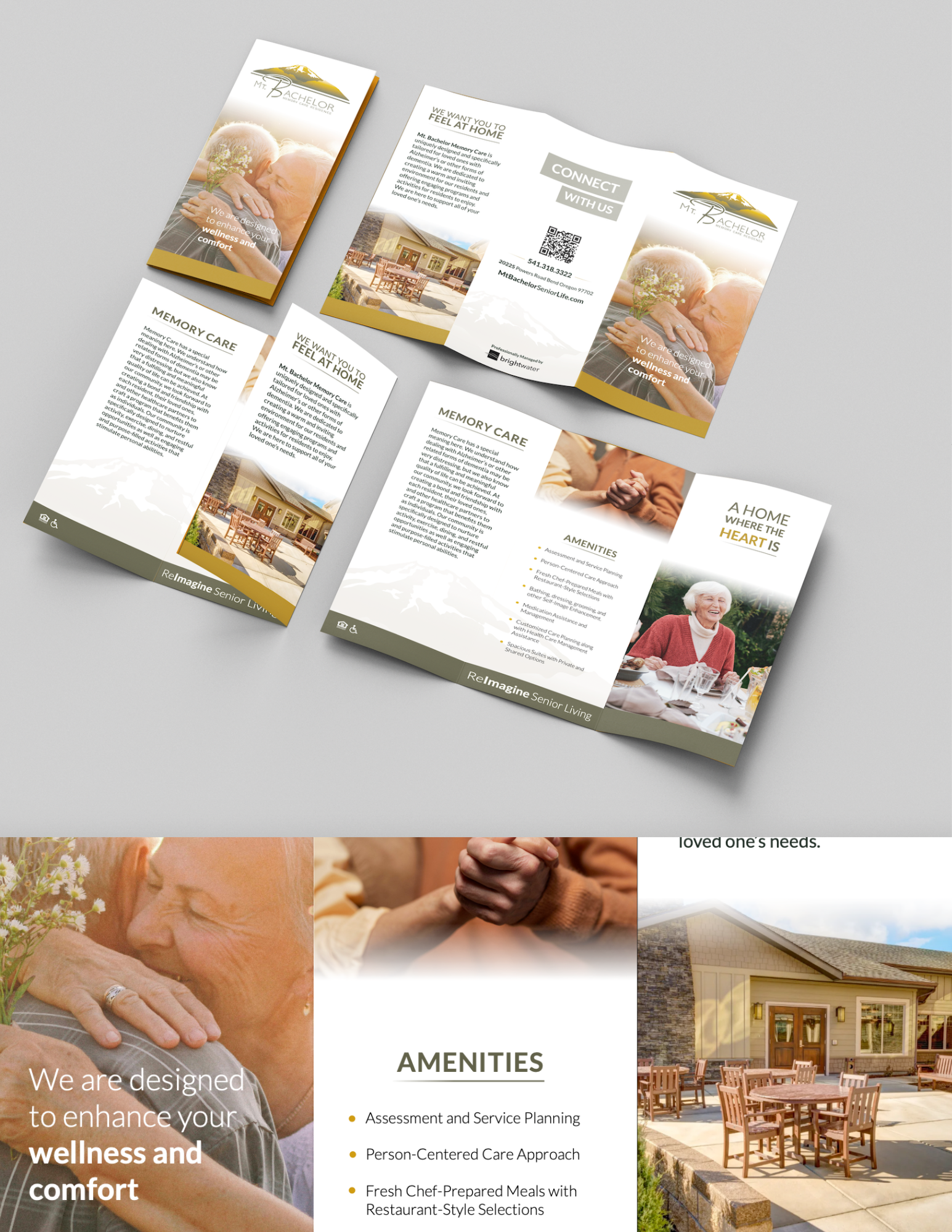
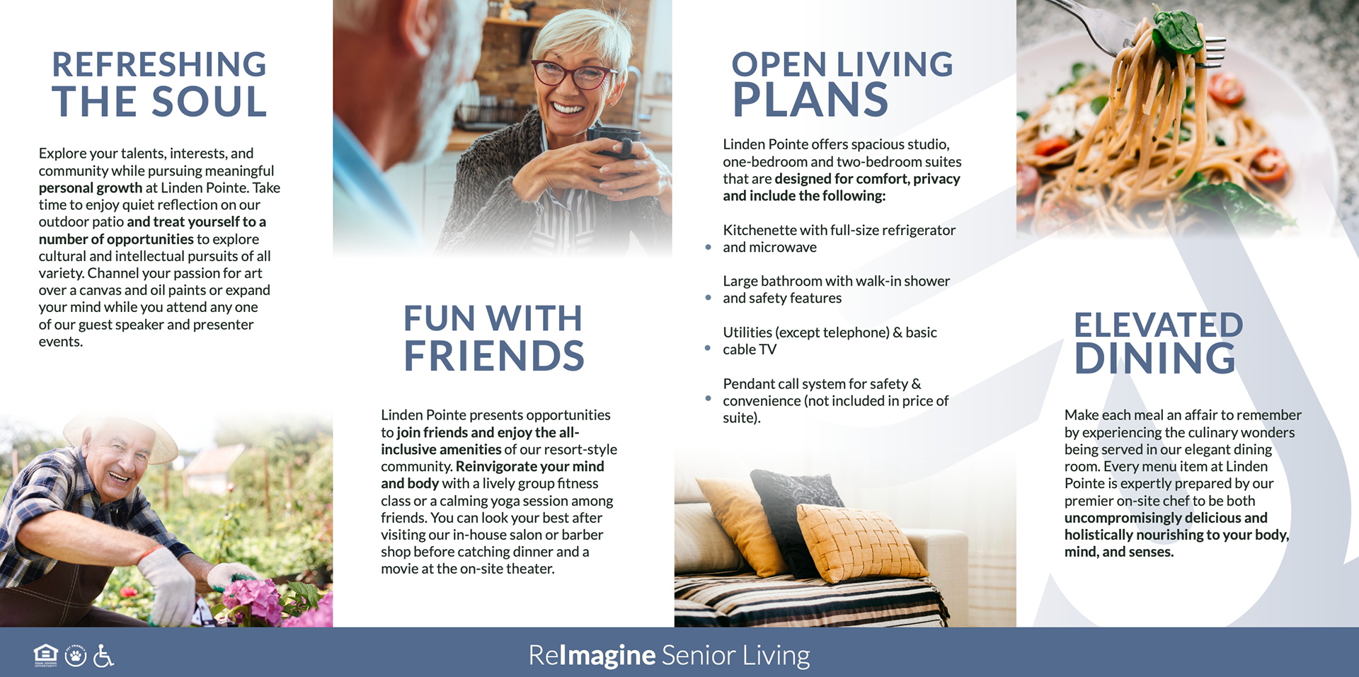
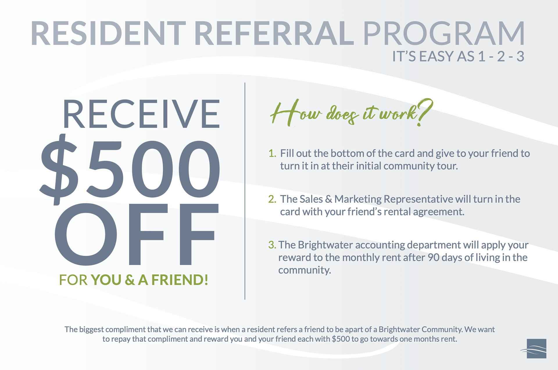
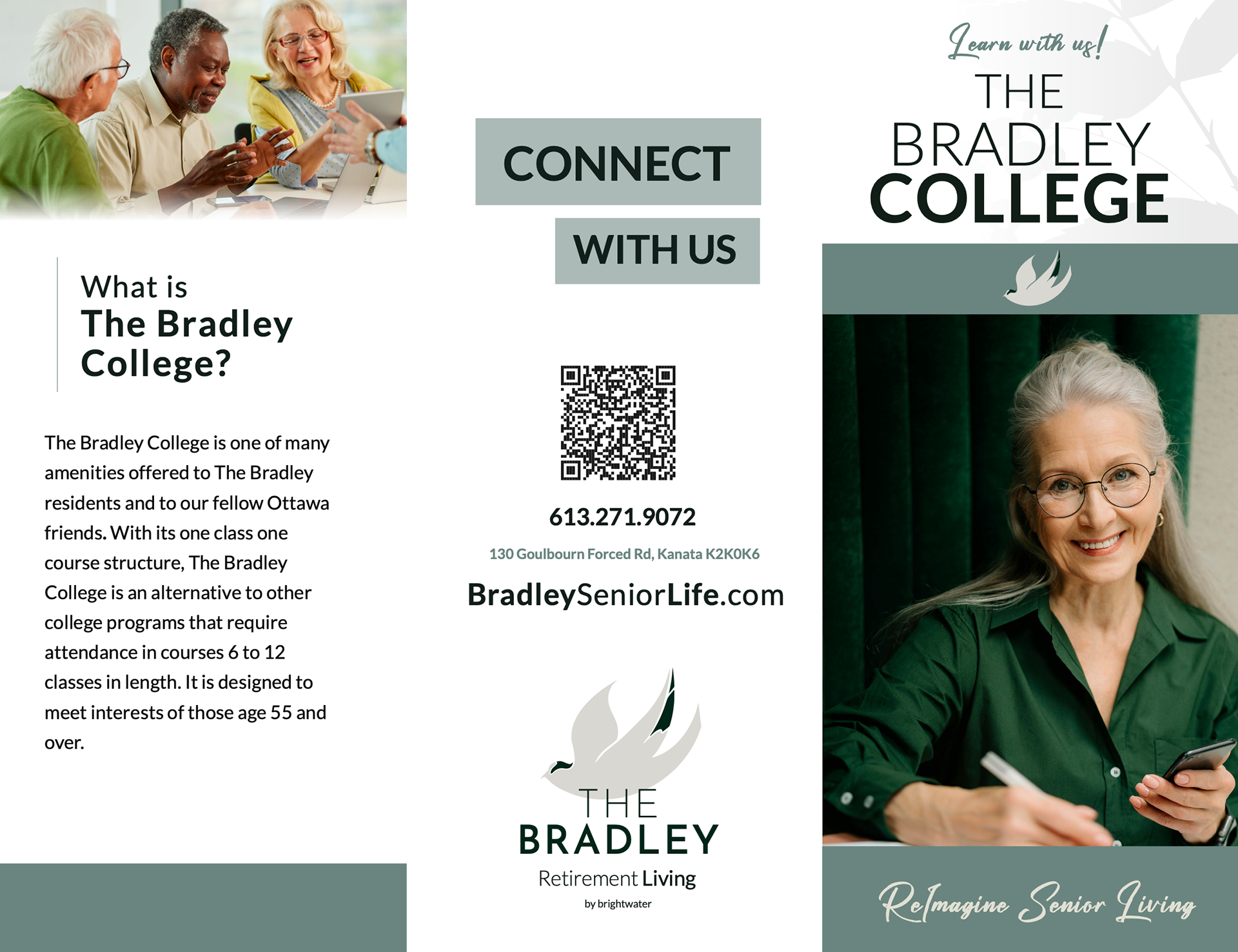
The design and marketing goals for Brightwater's 2025 rebrand was to create an elevated and cohesive brand to showcase authenticity and create a hospitable feeling through illustration, color, and photography. In addition, I wanted Brightwater's brand to be a stronger front-runner in the industry to showcase the level of care and attention residents are given at each community. In Addition to rolling out this new redesign with fresh logos, illustrations, and taglines, I wanted to create a marketing campaign that focused on telling a story and evoking an emotional connect through the imagery.
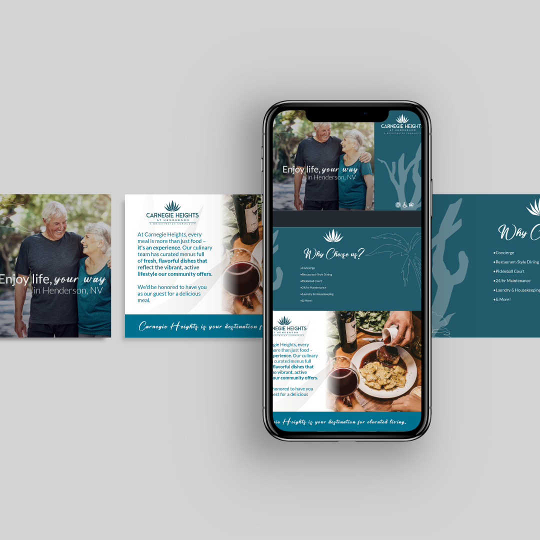
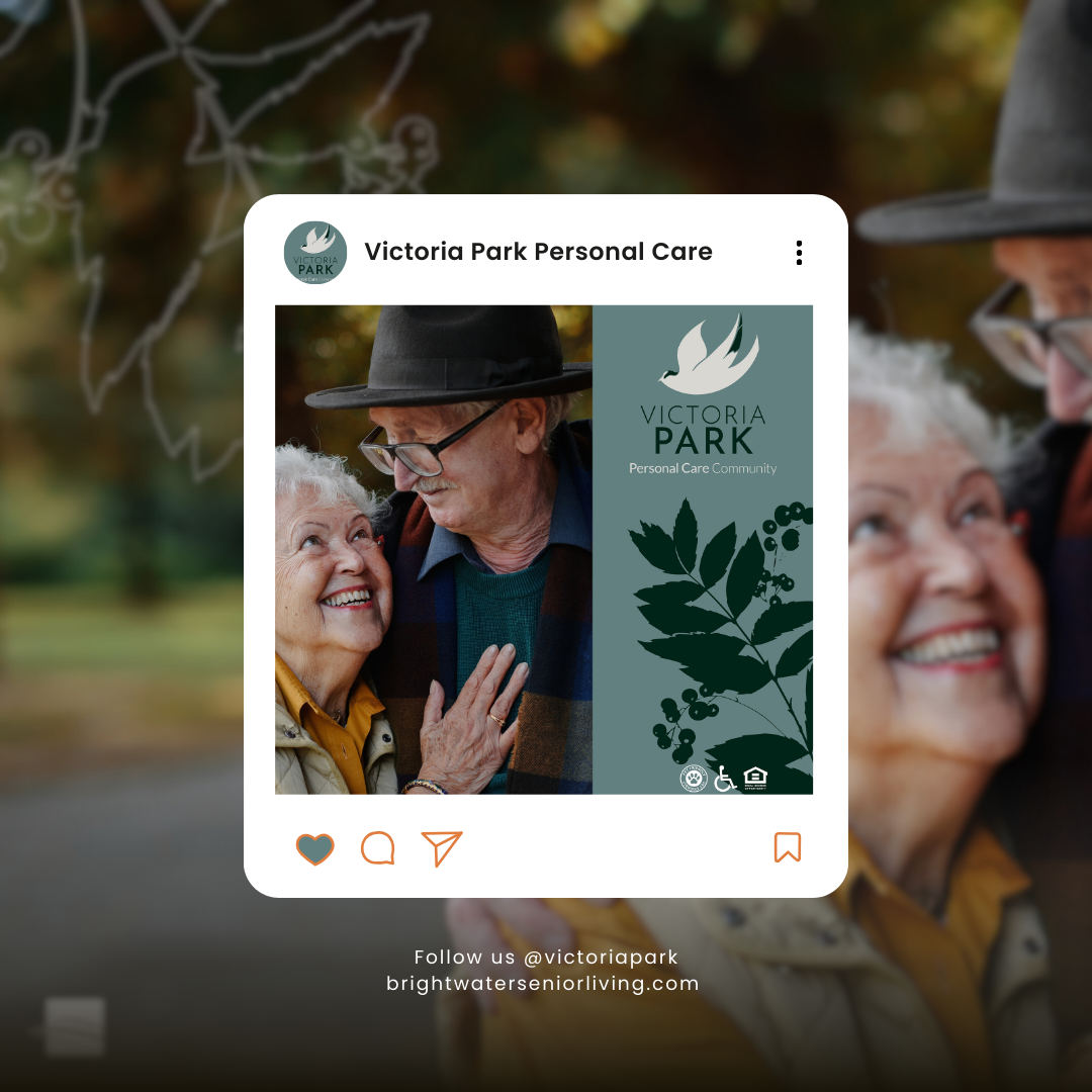
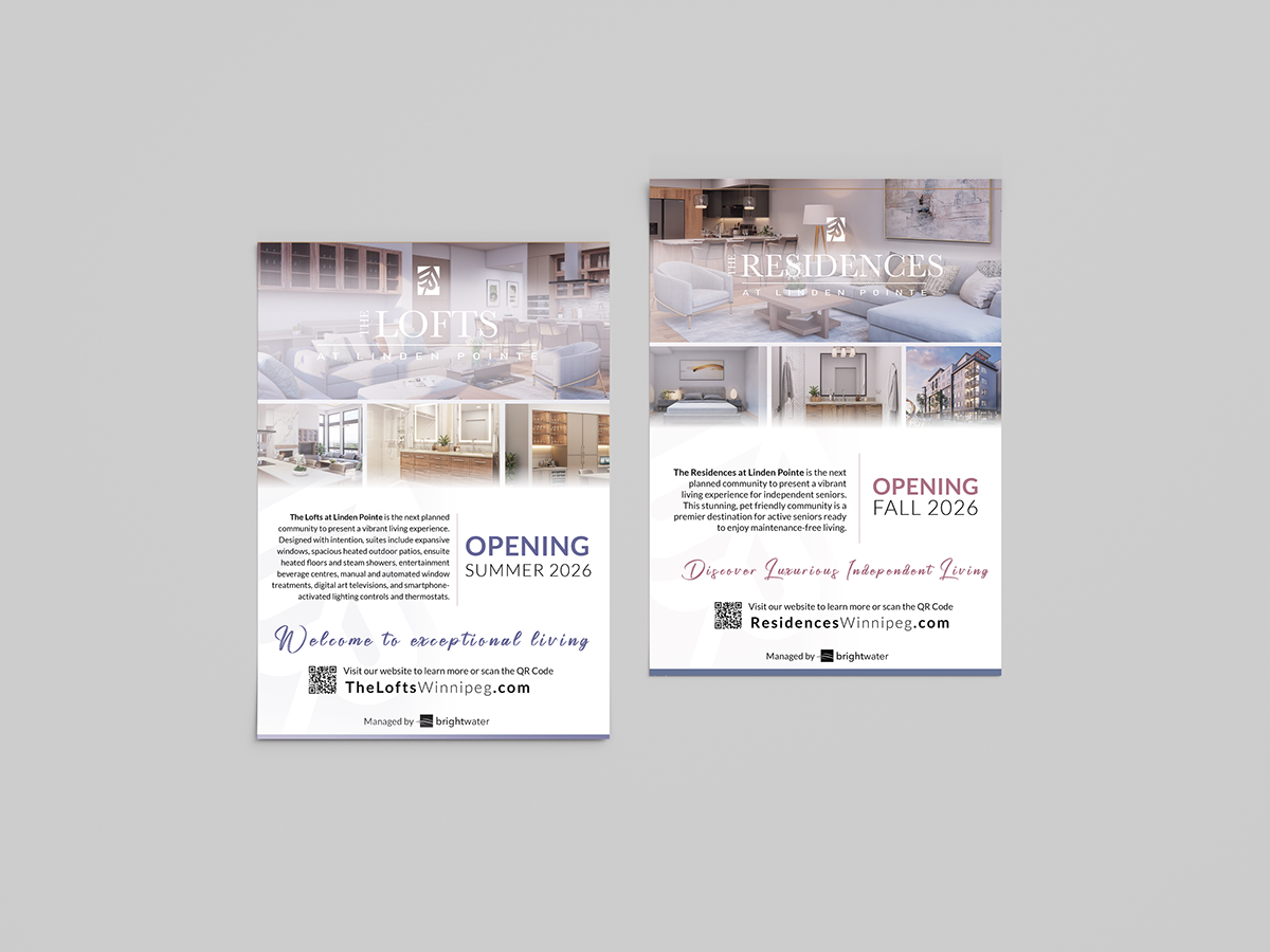
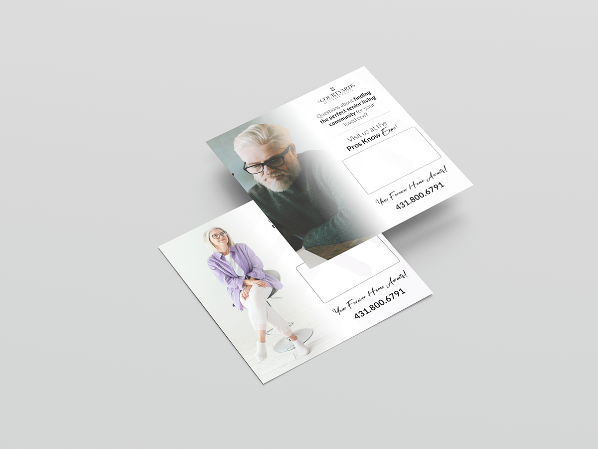
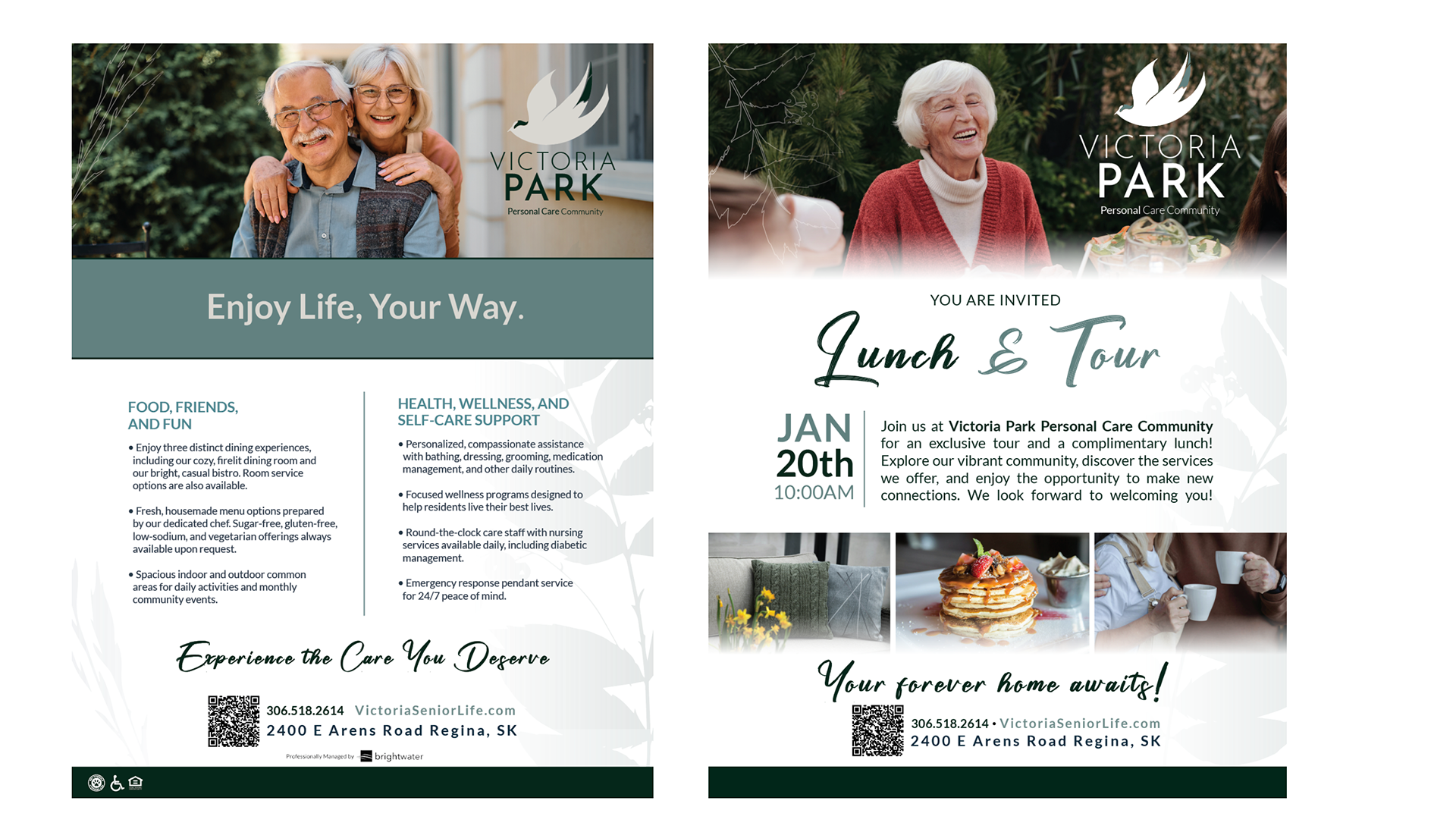
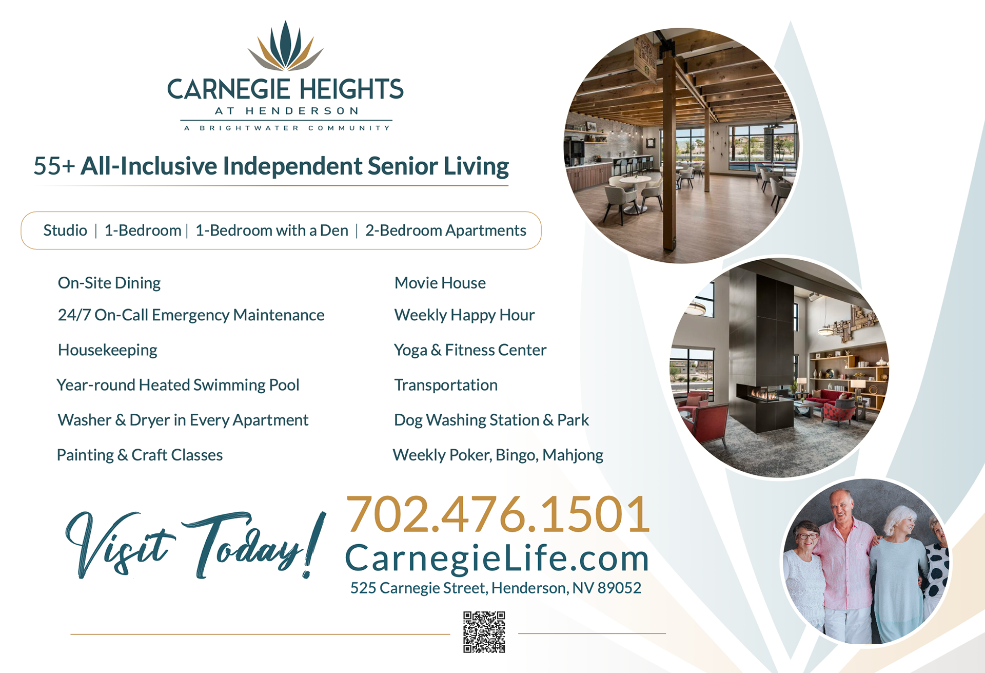
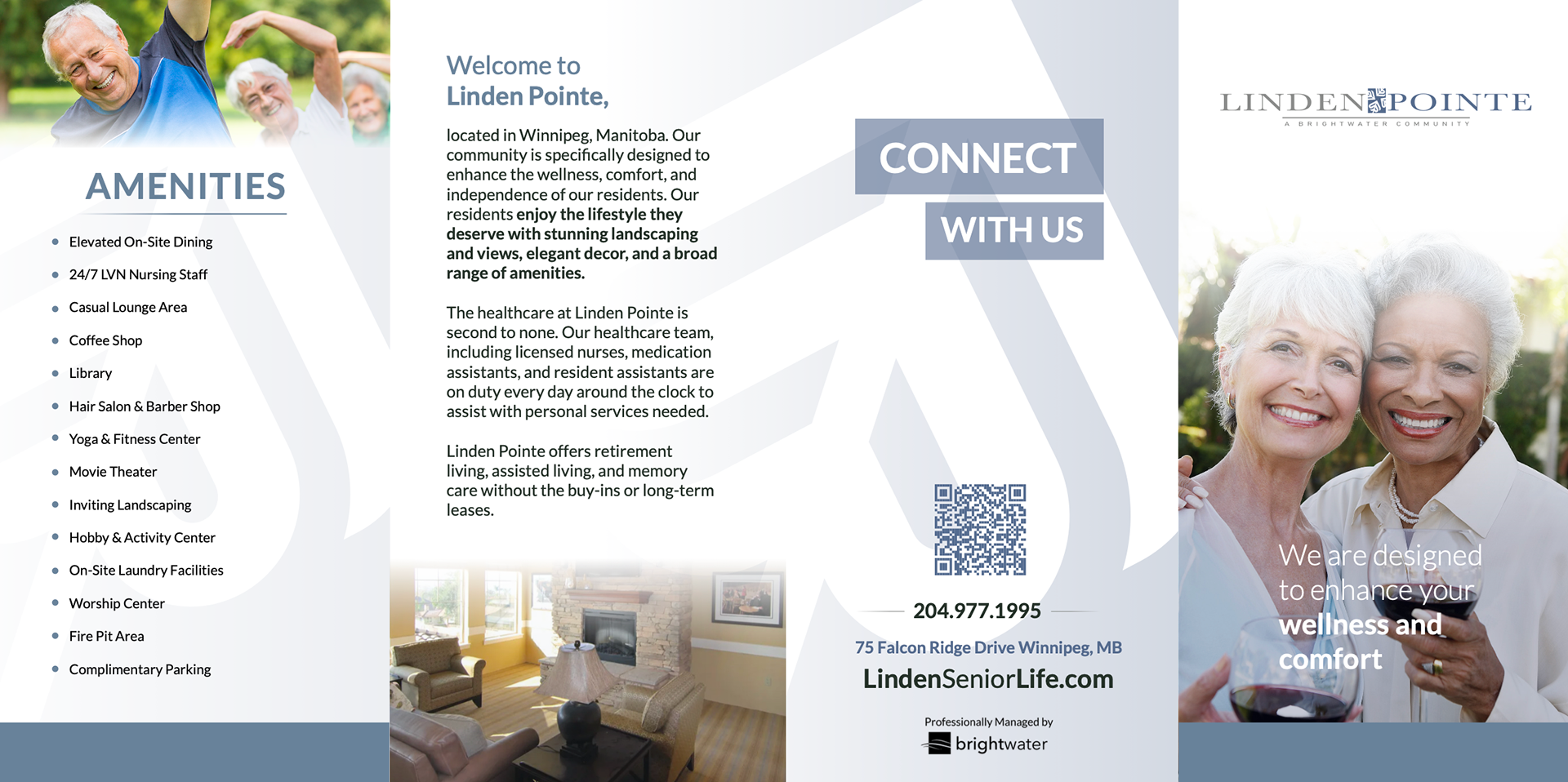
First, I created a few design templates for ads, flyers, and marketing collateral that would create a cohesive and professional look while still maintaining a fresh playfulness. Most senior living companies and their brands tend to look similar and keep older trends to appeal to an older audience, but with social media,
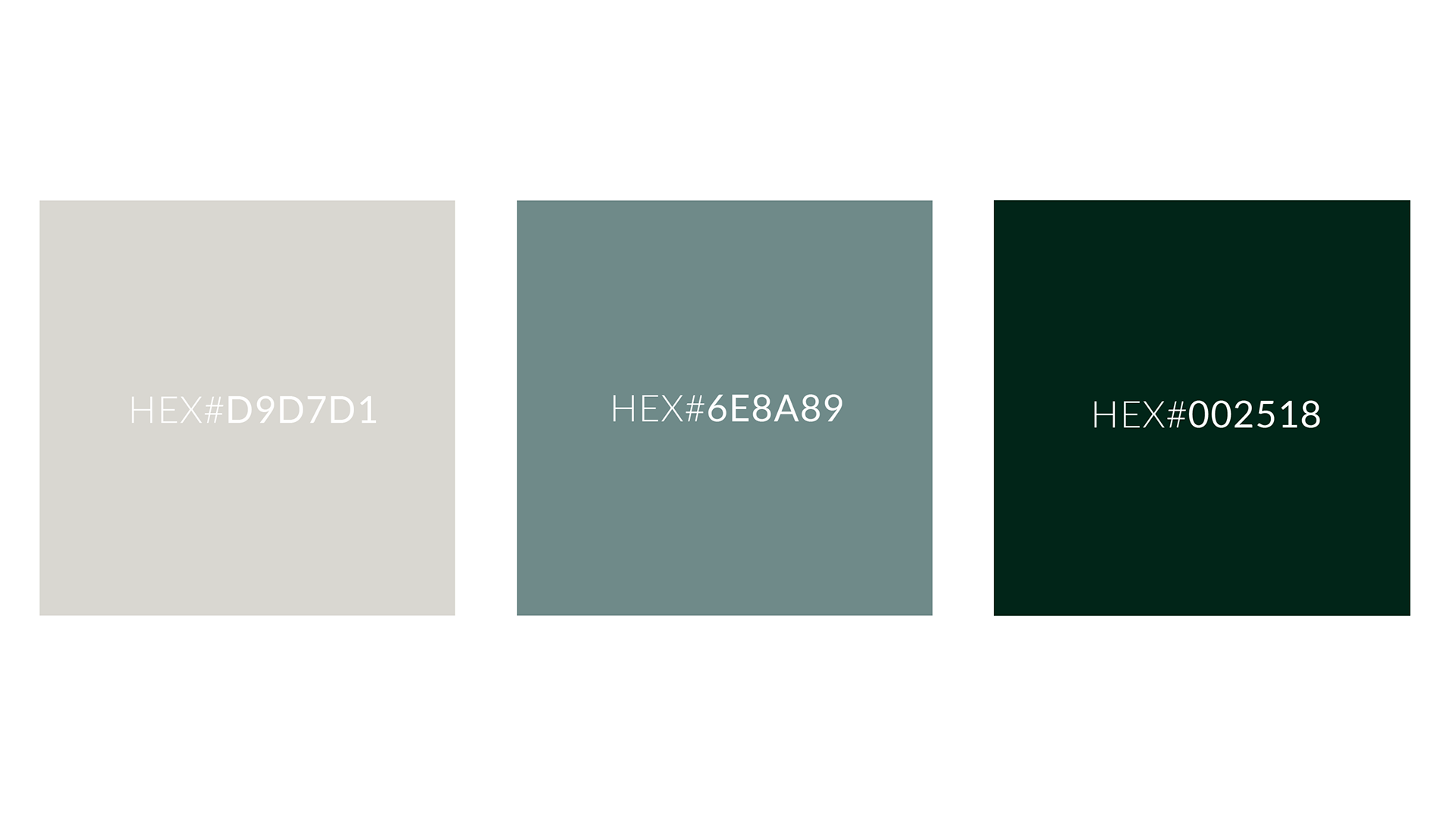

A BALANCED BRAND
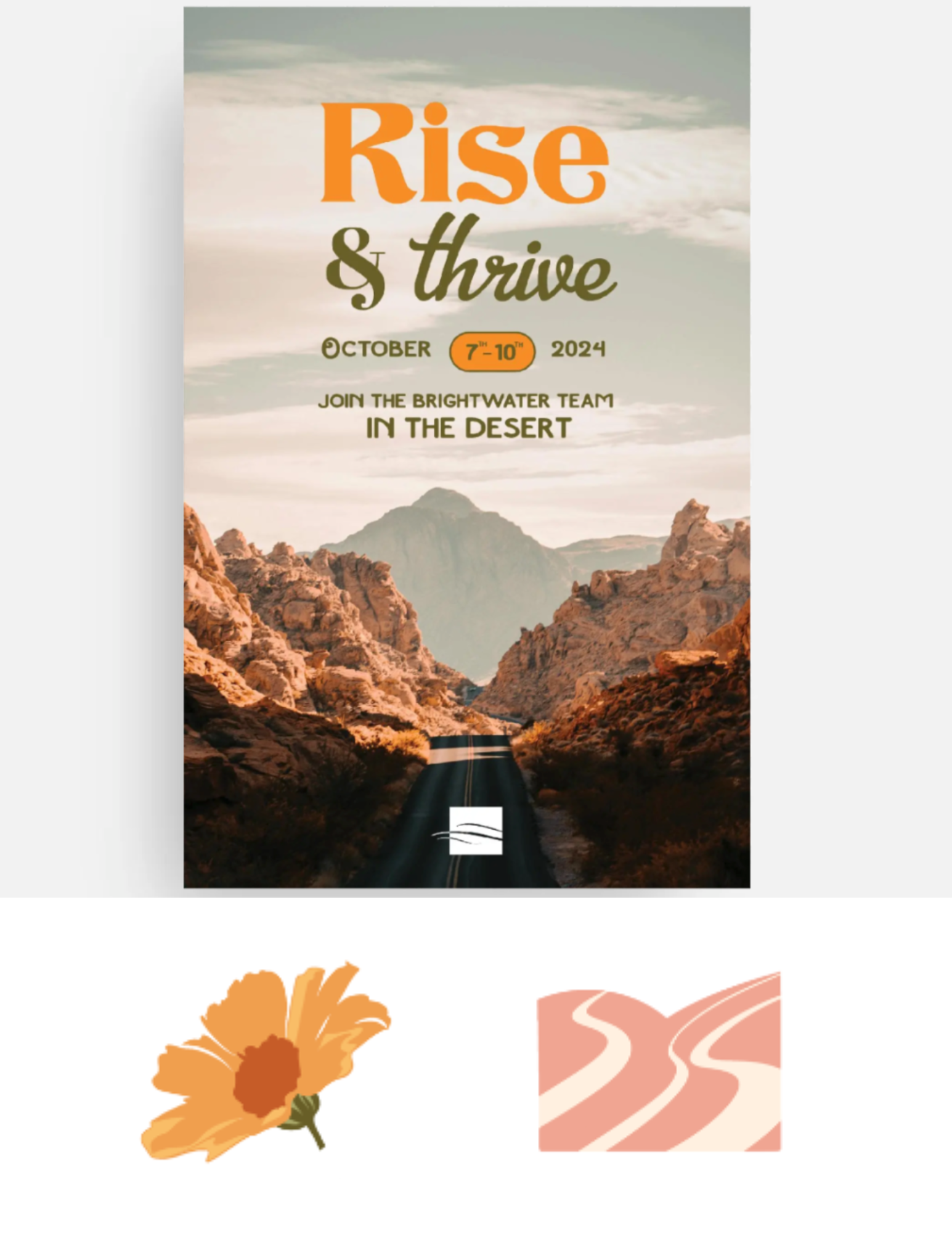
Even though each community might have differing logo and logo styles, creating a creative thread that connects all of them will help make Brightwater's marketing cohesive and professional, but sets it out from the rest. Creating different styles and assets that don't go well together will continue to confuse prospects or businesses about who Brightwater is and what their goal is. My plan was to use these illustrations and fresh layouts to enhance Brightwater's look and style so Brightwater and their communities are more recognizable for better brand recall.
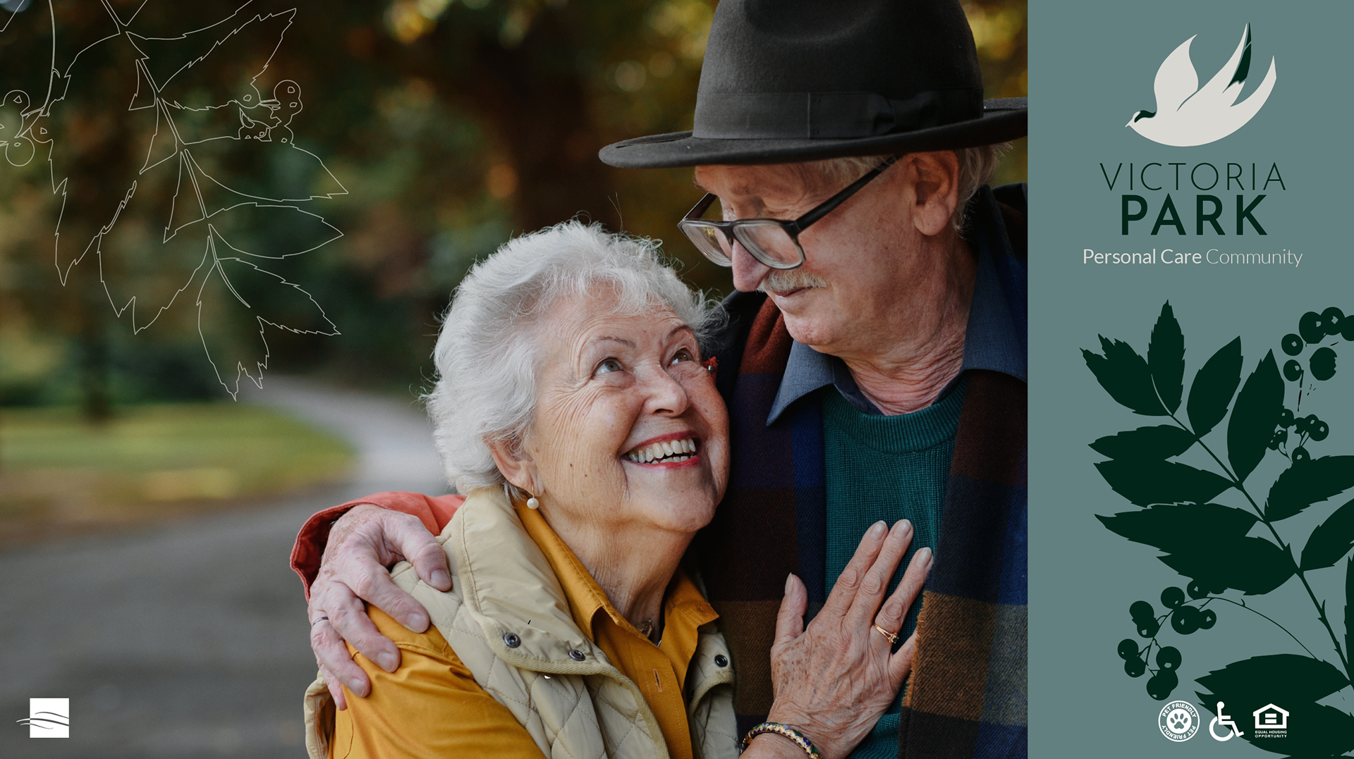
The plan for the illustration assets is to be used cross-functionally on different designs and on various platforms, maintaining a folder of assets for long-term usage. I wanted to focus on bits-and-pieces of region-specific plants or pieces of nature to create an elegant and intimate feeling as opposed to large detailed illustrations of an entire tree or plant. Doing this creates a cozy atmosphere that hints at the surrounding home of many of the residents. It enhances flyers, invitations, ads, and marketing collateral by adding small details that pay homage to the different areas where Brightwater's Communities are located. It showcases research and care of accurate detail that adds familiarity to the designs as well as an inviting element that is both delicate and strong. The nature imagery calls back to Brightwater's story, making these communities equally refreshing and peaceful rather than harsh and direct.

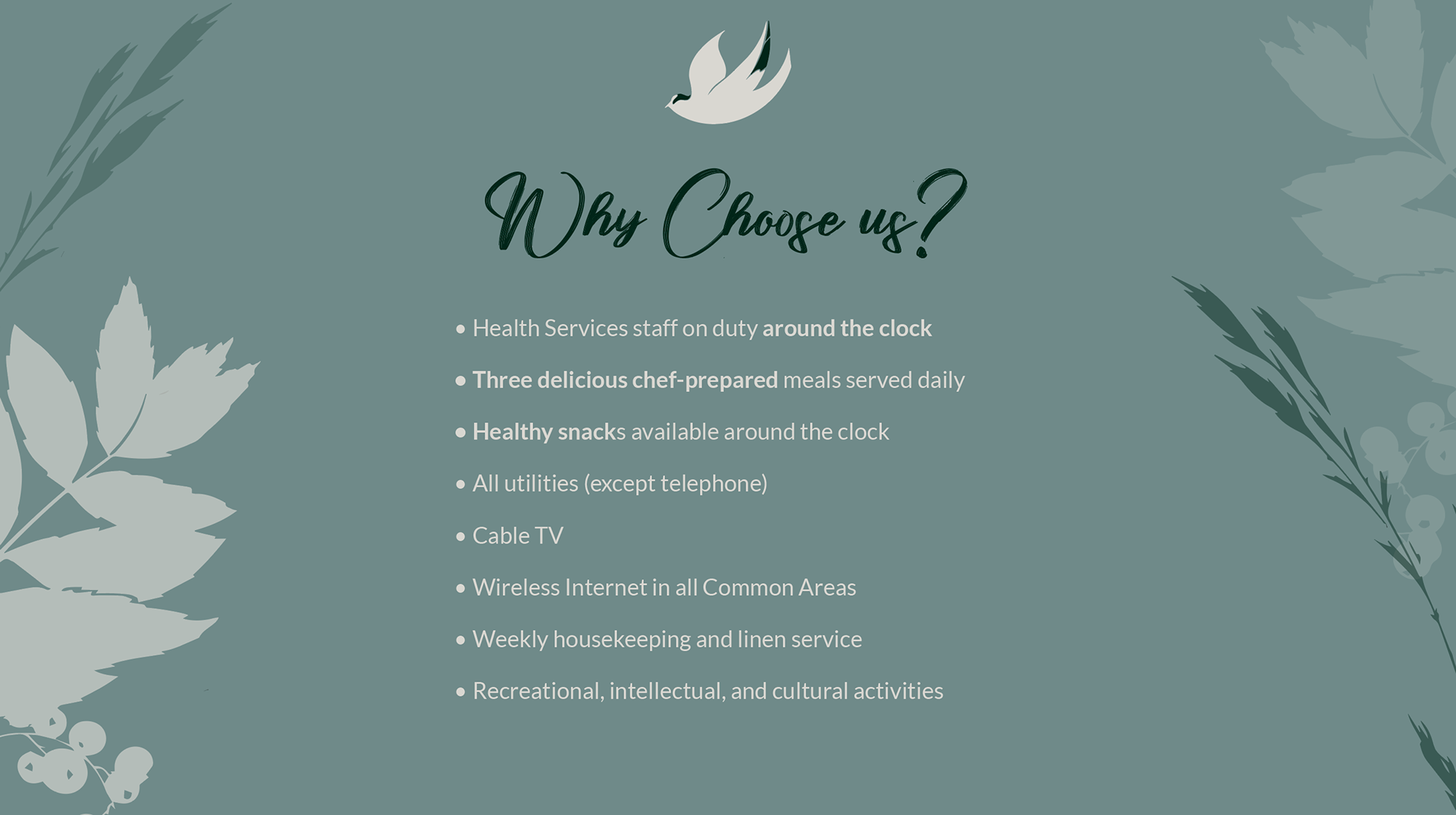
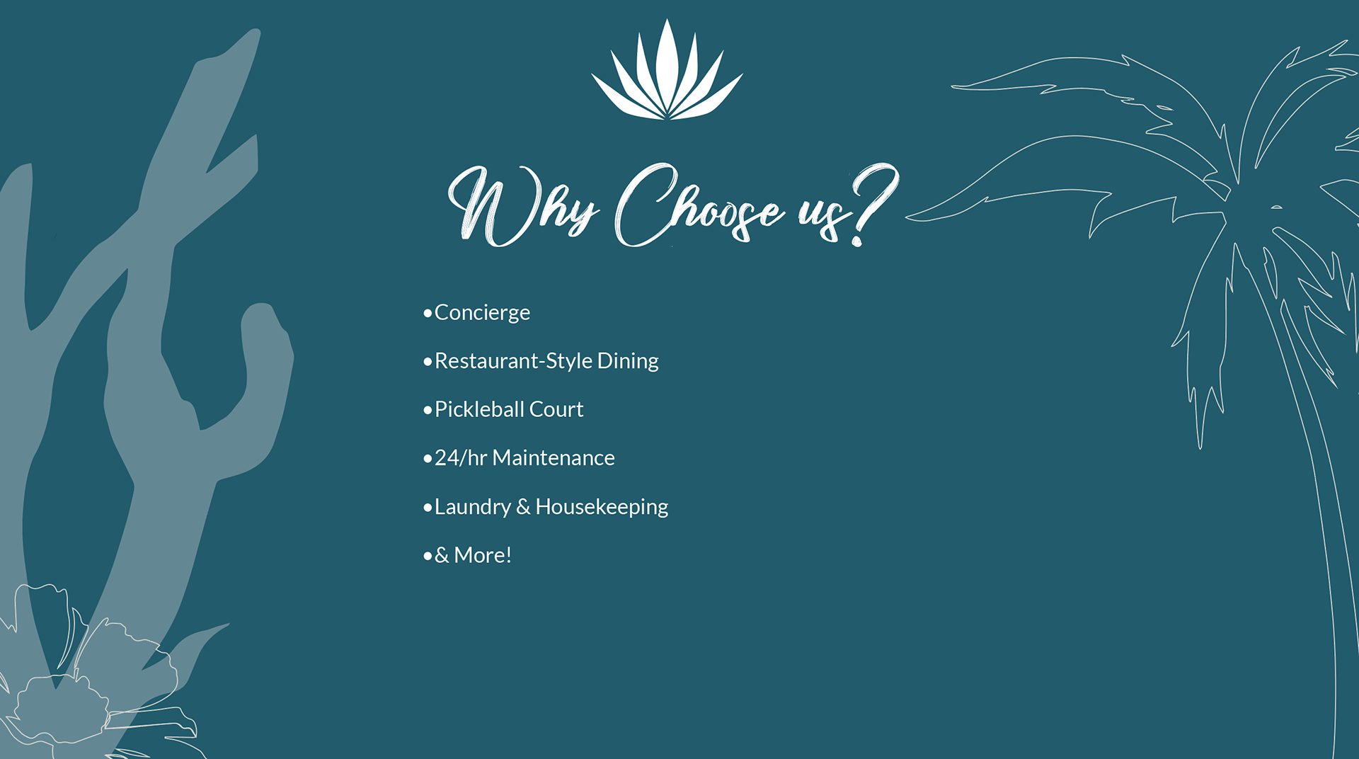
Thought Process & Sketches for New Rebrand Logo
Marketing Collateral, Invitations, & Advertisements



OTHER WORK & COMMUNITY OUTREACH
